Testing Painting Techniques - Zorn Limited Palette
Anders Zorn was a Swedish painter that was known for his portraits and for using a palette that consisted of just four colours. Specifically, he would use Lead White, Yellow Ochre, Vermillion and Ivory Black. You can mix a surprisingly large number of colours and tones with these paints. For example, as Ivory Black is actually a little bit blue you can mix it with Yellow Ochre to make an olive green colour.
What does this have to do with me and my little plastic figures? Supposedly, art students use the Zorn Limited Palette to practice mixing colours and as I’m terrible at mixing my own paints; I figured this would be a fun little exercise to help boost my painting skills. I had learned to paint the Games Workshop Way which is to have separate colours for my base, shadows, highlights and any washes that I might want to do. Good for Games Workshop’s profits with me buying all those paints, but not so good for me learning how to mix colours. Even now, if I need a new colour I’ll search for one to buy rather than mix my own even if I only need it for a single model or project. And as I had those spare miniatures from the WePrintMiniatures mystery box it seemed a perfect opportunity to learn. After all, I had watched a video in which Marco Frisoni painted with a Zorn palette and if he, a professional artist, can do it then I, a professional idiot, can do it too!
As to what paints to actually use, I decided on the ones below. The only one I needed to buy (I know, I know) was Yellow Ochre. I toyed with the idea of using Averland Sunset but decided against it in the end.
Lead White (Flake White) -> Army Painter Matt White
Yellow Ochre -> Vallejo Model Colour Yellow Ochre
Vermillion -> Citadel Evil Sunz Scarlet
Ivory Black -> Army Painter Matt Black
I also toyed briefly with the idea to use oil paints as Zorn himself would have but decided to stick with acrylics.

How it started…
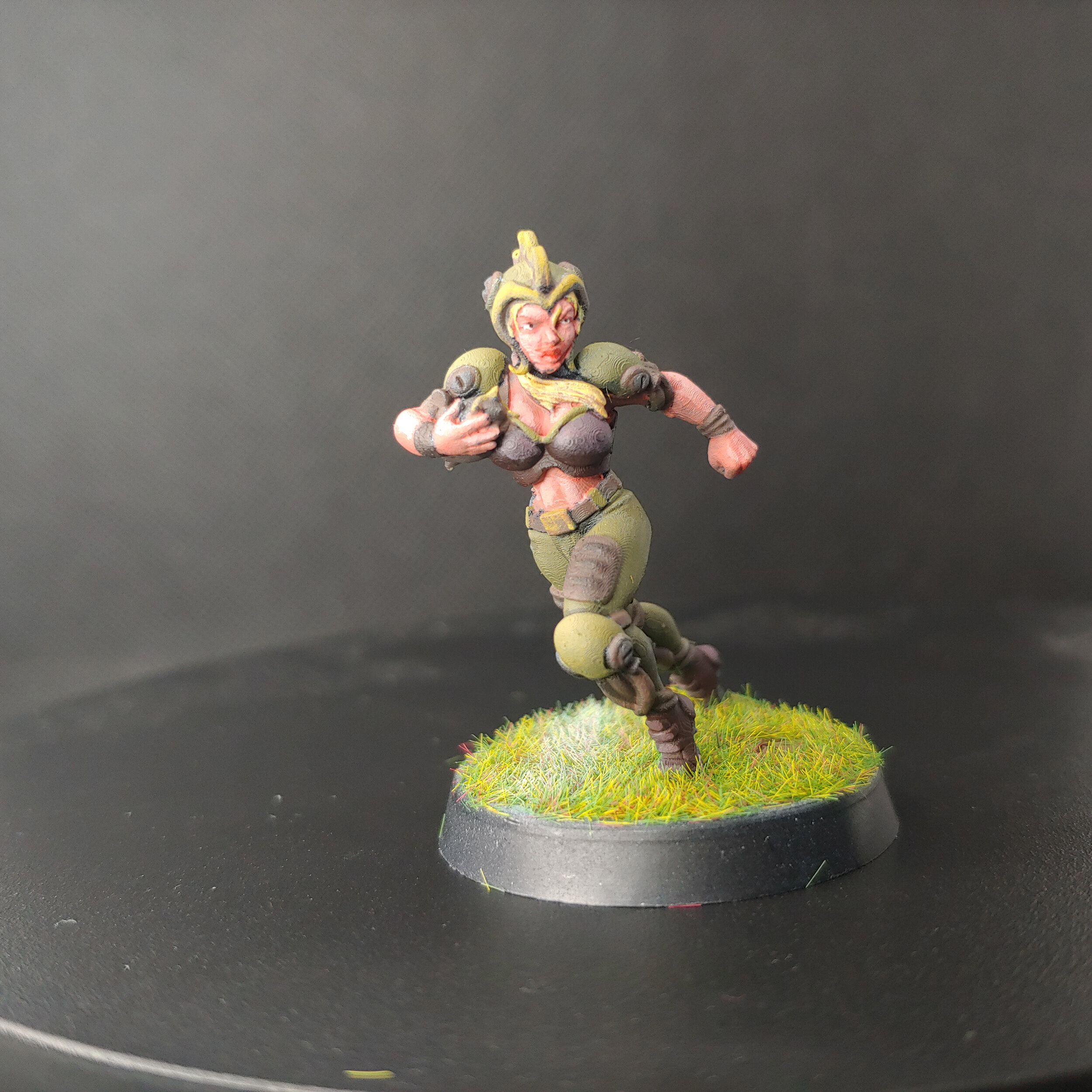
The figure that I chose is effectively a Blood Bowl proxy model, she has a fair amount of skin showing but the bulk of the model is her uniform. I stuck it to a base, primed it black and gave it a quick zenithal highlight with some white ink so that I would know where my shadows are. I busted out the wet palette, added the four colours above and I was ready to begin.

Someone get Corvus Belli on the line
As the skin is some of the deepest details on the model I decided to start with that. I recalled what Vince Venturella had said in one of his videos that caucasion skin is essentially varying tones of orange. Which sounds insane right? With that in mind I mixed approximately one part each of the red, yellow and white which resulted in quite a deep pink. This looked ideal for a starting point for the skin that I was then able to highlight by adding more and more white to the mix. For the uniform I went with the olive green mix that I mentioned above. I figured this would work best as a midtone so I glazed some black onto the undersides and into the recesses for shadows. And for the highlights I mixed in a bit of white to the green mix. With the remaining green mix, I added some red to make a nice brown that wasn’t too far from Dyrad Bark. I used this to do all the leather straps and any areas that I would later be painting gold. I added some black to the mix that I used to paint the ball, the darker colour would help to differentiate it from the other leather on the model. For the gold, quote-quote, I thinned down the yellow and glazed it on in thin layers. I’m pretty new to the world of non-metallic metal but I was quite pleased with the result. For the leather jerkin and boots that she is wearing I mixed red and black to make a deep burgundy that contrasted nicely with the green of her uniform. I then mixed in some white, which I used to highlight both areas. For the soles of her boots I mixed some black and white to make a grey. I put off doing the hair as I was a little unsure what colour to paint it, and at this point I felt like I was running out of colour combinations. I first wanted to do it red but I was worried that her hair would look too similar in tone to her skin. In the end, I mixed some yellow and white which I felt was different enough from the brown-yellow that the gold was painted in. By way of a wash, I mixed from the brown that I had used for the leather details with some Lahmian Medium (technically not a colour!) and washed it over the hair. I then went back with the yellow and white mix to highlight it. The very last and most difficult was the eyes. I very very carefully painted the sclera (the white part) with some white then even more carefully added small dots of black for the pupils.My eyesight is terrible so she did end up looking a little cross-eyed.

For the base, I dabbed on a bit of Agrellan Badlands crackle paint and once it was dry gave it a coat of Army Painter Strong Tone. For the grass, I thinned some PVA glue with some water so it wasn’t quite so goopy and sprinkled on some static grass. Once the glue had cured completely I used my airbrush to paint a thin line with white ink.
Overall I’m really pleased with how this little project turned out, I had a lot of fun mixing my own paints for once. Although I definitely need more practice at it, I just need some more miniatures to practice on. I did feel a little constrained by choice towards the end but in fairness I didn’t really use any of the base colour by themselves, aside from the yellow on the gold trim.

How it ended…
Yeah I know a lot of the colours ran, I definitely need more practice in setting up and using my wet palette.